
CSS Grid vs Flexbox: Which Layout Is Best in 2025?
This listicle clarifies the key differences between CSS Grid and Flexbox, empowering you to choose the optimal layout tool for your web projects.

We'll cover six key aspects, from basic Grid and Flexbox to advanced techniques like Subgrid and template areas, complete with illustrative code examples.
Learn when to use each individually and when to combine them offers the best solution.
You'll also see how CSS Grid facilitates intrinsic web design.
1. CSS Grid Layout
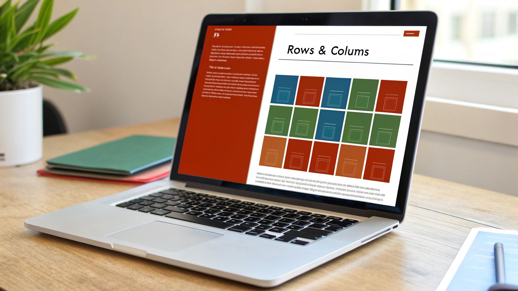
CSS Grid Layout is a powerful two-dimensional layout system specifically designed for crafting complex, grid-based web designs.
Unlike older methods that relied on floats and positioning hacks, CSS Grid allows developers to define rows and columns, enabling precise control over the placement and sizing of content within a container.
It excels at managing both the horizontal and vertical axes simultaneously, making it a game-changer when building intricate and responsive web page layouts.
Introduced as a formal specification in 2017, CSS Grid revolutionized web development by offering native tools for creating complex layouts without resorting to workarounds.
This makes it a critical concept in the "css grid vs flexbox" discussion.
CSS Grid empowers developers with a range of features for creating sophisticated layouts: explicit placement of items using grid-template-rows and grid-template-columns, the grid-gap property for defining spacing between grid items (now superseded by gap but still widely used), fractional units (fr) for flexible sizing, the minmax() function for responsive layouts, named grid areas using grid-template-areas for easy placement and organization, and the control over both implicit and explicit grid tracks.
Here's a simple code example demonstrating how to define a basic 3x3 grid:
.grid-container {
  display: grid;
  grid-template-columns: 1fr 1fr 1fr; /* Three equal width columns / grid-template-rows: 100px 100px 100px; / Three rows with 100px height / gap: 10px; / Space between grid items */
}

.grid-item {
  background-color: lightblue;
  /* For visualization */
}
Compared to Flexbox, which operates on a single axis at a time, Grid’s two-dimensional approach allows for more complex arrangements.
For example, creating a Holy Grail layout (header, footer, main content, and two sidebars) is significantly simpler with Grid than with Flexbox:
.grid-container {
  display: grid;
  grid-template-areas: "header header header" "sidebar-left main sidebar-right" "footer footer footer";
  grid-template-rows: 100px 1fr 50px; /* Define row heights / grid-template-columns: 200px 1fr 200px; / Define column widths */
  gap: 10px;
}

.header {
  grid-area: header;
}

.sidebar-left {
  grid-area: sidebar-left;
}

.main {
  grid-area: main;
}

.sidebar-right {
  grid-area: sidebar-right;
}

.footer {
  grid-area: footer;
}
Pros:
- Ideal for overall page layouts: Grid's two-dimensional control makes it perfect for structuring entire web pages.
- Handles rows and columns simultaneously: This simplifies complex layouts dramatically.
- Excellent for asymmetrical layouts: Grid handles uneven distributions of content with ease.
- No parent-child relationship required: Grid items don’t need a direct parent-child relationship for placement.
- Built-in gap properties: Simplify spacing and eliminate margin hacks.
- Supports explicit item placement: Offers fine-grained control over the position of each grid item.
Cons:
- Steeper learning curve: Grid is more complex than Flexbox initially.
- Limited older browser support: While modern browsers fully support Grid, older browsers like IE11 have only partial support.
- Overkill for simple layouts: For basic one-dimensional layouts, Flexbox is often a simpler solution.
Examples of Successful Implementations:
- Mozilla Developer Network (MDN): Uses Grid for its documentation layout.
- CSS-Tricks.com: Implemented Grid for their article layouts.
- The Guardian: Employs a grid system for its website layout.
Tips for Using CSS Grid:
- Use browser DevTools: Firefox and Chrome have excellent Grid inspectors for debugging.
- Start with a sketch: For complex layouts, sketch your
grid-template-areasfirst. - Combine with media queries: Use media queries to create responsive grid designs.
- Use
auto-fillandauto-fit: Combine these withminmax()for responsive columns. - Consider fallbacks: Use
@supportsfor older browsers that don’t fully support Grid. - Name grid areas meaningfully: Improves code readability.
CSS Grid's robust features and ability to handle intricate layouts make it a cornerstone of modern web development.
While Flexbox excels at managing one-dimensional layouts, Grid’s two-dimensional capabilities are essential for creating complex, responsive, and well-structured web pages, making it an indispensable tool in any front-end developer’s toolkit, and a key player in the "css grid vs flexbox" debate.
It deserves its place on this list because it represents a fundamental shift in how we approach web layout, offering unprecedented control and flexibility.
2. Flexbox (Flexible Box Layout)
Flexbox, short for Flexible Box Layout, is a one-dimensional layout method primarily designed for arranging items within a single row OR column.
It excels at distributing available space and aligning items inside a container, even when the size of those items is unknown or dynamic.
Think of it as a powerful tool for controlling the arrangement and spacing of elements along a single axis, either horizontally or vertically.
Flexbox gained broad browser support around 2015, effectively solving many common layout challenges that previously plagued web developers. It remains the ideal choice for component-level designs, smaller layouts within a larger page structure, and situations where precise control over alignment and space distribution is crucial.

Flexbox leverages several key properties to achieve its layout magic.
The flex-direction property sets the primary axis (either row or column), dictating the main direction items are laid out.
justify-content controls alignment along the main axis, while align-items manages alignment along the cross-axis.
Fine-grained control over item sizing is achieved using flex-grow, flex-shrink, and flex-basis.
The order property allows you to change the visual order of items without altering the underlying HTML, and flex-wrap enables wrapping of items onto multiple lines if they overflow the container.
Here's a simple code example demonstrating the basics of Flexbox:
.container {
  display: flex;
  justify-content: space-around; /* Distribute space around items / align-items: center; / Vertically center items */
}

.item {
  padding: 10px;
  background-color: lightblue;
}
This code creates a flex container with three items, distributed evenly with space around them and vertically centered.
Contrast this with a pre-Flexbox approach that might have relied on floats and clearfix hacks, highlighting Flexbox's simplified approach.
Pros:
- Excellent for component-level layouts: Perfect for smaller, self-contained sections like navigation menus, card layouts, and form elements.
- Simpler syntax than Grid for basic needs: Easier to learn and implement for common layout patterns.
- Better browser support, especially in older browsers: Ensures wider compatibility for your projects.
- Ideal for distributing space between items: Provides precise control over spacing and alignment.
Cons:
- Limited to one-dimensional layouts: Can be challenging to create complex grid-like structures. This is where CSS Grid shines, handling two-dimensional layouts with ease.
- Complex to create grid-like structures (better suited for Grid): If you need a true grid layout, CSS Grid is the more suitable option. Trying to emulate a grid with Flexbox can become unwieldy.
Examples of Successful Implementation:
- Twitter's tweet component layout
- Facebook's comment sections and feed items
- Navigation menus on most modern websites
Tips for Using Flexbox:
- Use
flex: 1as shorthand for creating equally sized flexible items. - Remember
flex-directiondetermines your main axis (row or column). - For vertical mobile menus, use
flex-direction: column. - Set
flex-wrap: wrapfor responsive layouts that adapt to different screen sizes.
Flexbox's place in the "CSS Grid vs Flexbox" discussion is solidified by its targeted approach to one-dimensional layouts.
While CSS Grid handles complex two-dimensional scenarios, Flexbox remains the go-to solution for many everyday layout tasks, providing a streamlined and efficient way to control alignment, spacing, and distribution within a single row or column.
This makes it highly relevant for front-end developers aiming for clean, responsive, and easily maintainable code. It's a fundamental tool in the modern web developer's arsenal, especially crucial for component-based architectures and responsive design.
3. CSS Grid for Overall Layout + Flexbox for Components
In the ongoing debate of CSS Grid vs. Flexbox, a hybrid approach has emerged as a best-practice solution for many developers: using CSS Grid for the overall page layout and Flexbox for arranging elements within individual components.
This method combines the two-dimensional prowess of Grid with the one-dimensional flexibility of Flexbox, creating a powerful synergy that simplifies complex layouts and improves code organization.
This technique leverages Grid's two-dimensional control for complex page layouts while utilizing Flexbox's strengths for simpler, one-dimensional component alignment, creating a powerful and flexible layout system.
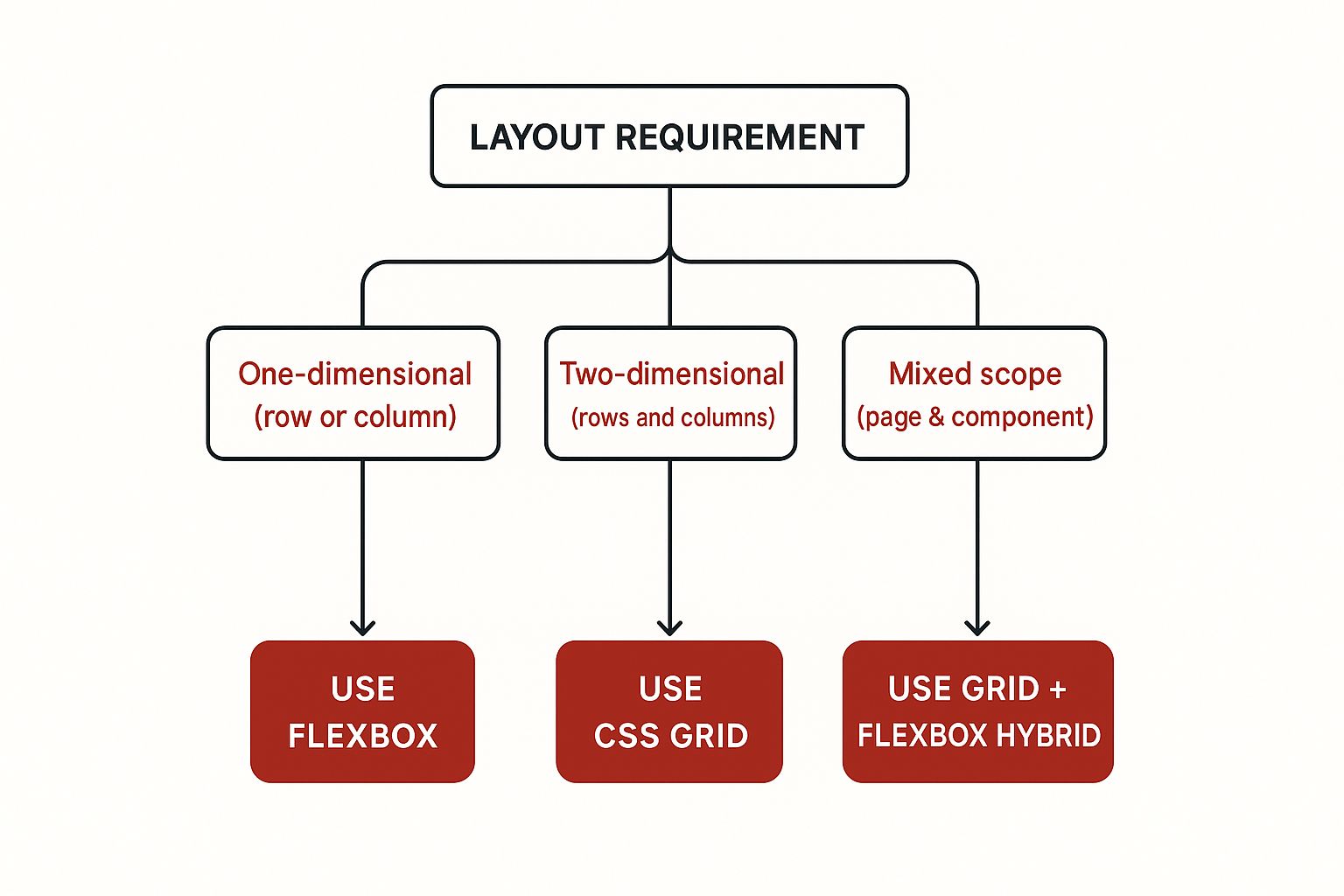
The infographic above provides a decision tree to help you choose between Grid and Flexbox for specific layout tasks.
It visually represents the decision process of choosing the optimal layout module based on the needs of your project. This allows developers to quickly assess whether they need one- or two-dimensional control and select the appropriate tool.
This hybrid approach lets you define the main page sections (header, footer, sidebar, main content) using CSS Grid, providing a solid structural foundation.
Then, within these sections, you can utilize Flexbox to handle the alignment and arrangement of items within individual components, like navigation menus, card content, or form elements.
/* Grid for overall layout */
.container {
  display: grid;
  grid-template-columns: 1fr 3fr;
  grid-template-rows: auto 1fr auto;
  grid-template-areas: "header header" "sidebar main" "footer footer";
}

header {
  grid-area: header;
}

aside {
  grid-area: sidebar;
}

main {
  grid-area: main;
}

footer {
  grid-area: footer;
}

/* Flexbox for component layout within the sidebar */
.sidebar-nav {
  display: flex;
  flex-direction: column;
}

.sidebar-nav li {
  margin-bottom: 10px;
}

/* Flexbox for component layout (card content) within main */
.card-content {
  display: flex;
  justify-content: space-between;
  align-items: center;
}
Examples of websites successfully employing this hybrid strategy include Smashing Magazine, GitHub's repository pages, Notion's document layout, Medium's article structure, and various Shopify store layouts.
These sites demonstrate the scalability and effectiveness of combining Grid and Flexbox.
Pros:
- Combines Strengths: Leverages the specific advantages of both Grid and Flexbox for optimal results.
- Semantic Layout: Encourages a more purpose-driven approach to layout decisions.
- Organized Code: Improves code maintainability and readability.
- Performance: Uses the right tool for the job, leading to more efficient rendering.
- Component-Based Design: Facilitates the creation of reusable UI components.
Cons:
- Learning Curve: Requires understanding both Grid and Flexbox.
- Potential Over-Nesting: Can lead to overly complex HTML if not planned carefully.
- Team Consistency: Needs clear guidelines to maintain a consistent approach across a development team.
- Browser Compatibility: May require fallbacks for older browsers, though support is generally good for both Grid and Flexbox in modern browsers.
Tips for Implementation:
- Decision Tree: Use a decision tree (like the one shown above) to guide your choice between Grid and Flexbox. If you need to control layout in two dimensions (rows and columns), choose Grid. If you only need to control one dimension, Flexbox is usually sufficient.
- Document Your Approach: Create clear documentation for your team to ensure consistent usage of Grid and Flexbox.
- Reusable Components: Develop reusable CSS classes for common layout patterns.
- CSS Custom Properties: Leverage CSS custom properties to share values between Grid and Flexbox code.
- Responsive Design: Test your layouts thoroughly at various breakpoints to ensure they adapt correctly.
This hybrid approach is widely popularized by industry experts like Rachel Andrew and Jen Simmons through their books, talks, and online resources like CSS-Tricks and Layout Land.
Modern CSS frameworks such as Tailwind CSS often encourage this best-practice method for structuring layouts, reflecting its effectiveness in building robust and maintainable web applications.
This approach deserves its place in this list because it offers a pragmatic and efficient solution to complex layout challenges, allowing developers to create highly structured and responsive web designs by strategically utilizing both CSS Grid and Flexbox.
4. Subgrid (CSS Grid Level 2)
Subgrid is a powerful feature introduced in CSS Grid Level 2 that significantly enhances the ability to create complex, nested grid layouts.
In the context of "CSS Grid vs. Flexbox," subgrid offers a distinct advantage over Flexbox when dealing with nested structures requiring precise alignment with the parent grid.
While Flexbox excels at one-dimensional layouts, it struggles with aligning items across nested flex containers.
Subgrid solves this by allowing nested grid items to inherit the tracks (rows and columns) defined by their parent grid.
This creates perfectly aligned nested grids, simplifying the creation of sophisticated layouts that were previously challenging or impossible with just CSS Grid Level 1 or Flexbox.
Here’s how it works:
Imagine a parent grid with defined columns. Within this grid, you have a grid item that needs to be further divided into its own grid.
Without subgrid, you would have to redefine the columns within the child grid, ensuring they align with the parent.
Subgrid eliminates this redundancy by allowing the child grid to directly inherit the parent's track definitions.
/* Parent Grid */
.parent {
  display: grid;
  grid-template-columns: repeat(3, 1fr);
}


/* Child Grid (using subgrid) */
.child {
  display: grid;
  /* Inherits columns from parent */
  grid-template-columns: subgrid;
}

/* Compared to defining columns explicitly in the child: Child Grid (without subgrid) */
.child {
  display: grid;
  grid-template-columns: repeat(3, 1fr);
}
The subgrid value tells the child grid to use the same column tracks as its parent.
This eliminates the need for duplicated column definitions and ensures perfect alignment.
This is a major advantage over Flexbox, where nested Flexbox containers don't inherit their parents' structure in this way. This often necessitates workarounds and additional markup to achieve the same alignment.
Features and Benefits:
- Inheritance of parent grid tracks: The cornerstone of subgrid, enabling seamless alignment.
grid-template-rows/columns: subgrid: The syntax for activating subgrid in either or both dimensions.- Maintains parent grid's track sizing: Child grids respect the sizing defined by the parent.
- Supports all grid alignment properties: Standard grid alignment features work seamlessly with subgrid.
- Works with named grid lines and areas: Further enhancing layout control and readability.
- Respects the
gapproperty from parent grid: Consistent spacing is maintained across nested levels.
Pros:
- Creates perfectly aligned nested grid structures: Solves the core alignment challenge.
- Solves complex layout challenges like form alignment: Simplifies complex layouts like aligning form labels and inputs across different sections.
- Reduces code duplication for nested grids: Eliminates redundant track definitions.
- Maintains consistent sizing across nested levels: Ensures predictable and harmonious layouts.
- Improves semantic HTML by reducing wrapper divs: Often eliminates the need for extra divs used for alignment workarounds.
Cons:
- Limited browser support: While support is growing, it's essential to check compatibility and provide fallbacks.
- Can be complex to understand conceptually: Requires grasping the parent-child grid relationship.
- Requires fallbacks for non-supporting browsers: Using
@supportsis crucial.
Examples:
- Card Layouts: Aligning headers and footers across cards with varying content heights.
- Form Layouts: Perfect alignment of labels and inputs across different form sections.
- Product Listings: Consistent alignment of elements like titles, prices, and images despite varying content lengths.
Tips:
- Always include fallbacks using
@supports: Essential for cross-browser compatibility. For example:
.child {
  display: grid;
  grid-template-columns: repeat(3, 1fr); /* Fallback */
}

@supports (grid-template-columns: subgrid) {
  .child {
    grid-template-columns: subgrid;
  }
}- Test thoroughly across browsers: Ensure consistent behavior across different browser versions.
- Use
grid-template-rows: subgridfor vertical alignment only when needed: Apply subgrid judiciously. - Consider simpler alternatives for basic layouts: Subgrid may be overkill for simple scenarios.
- Combine with CSS custom properties for flexible designs: Enhance maintainability and dynamic styling.
Subgrid is a valuable addition to the CSS Grid toolkit, providing a robust solution for complex nested grid alignment challenges where Flexbox falls short.
5. CSS Grid Template Areas
CSS Grid Template Areas is a powerful feature that simplifies complex layout creation, offering a more intuitive and visual approach than traditional CSS methods.
In the context of CSS Grid vs. Flexbox, grid-template-areas shines when dealing with two-dimensional layouts, making it a strong contender against Flexbox for specific use cases.
It allows developers to define layout sections using named areas within a grid container, essentially drawing the layout with ASCII art-like strings.
This visual representation greatly enhances the readability and maintainability, especially for intricate responsive designs.
This approach designates specific areas within the grid, which are then referenced by child elements using the grid-area property.
This makes it incredibly easy to visualize and manipulate the layout structure. For instance, rearranging sections for different screen sizes becomes significantly simpler within media queries.
Consider a simple three-column layout. With grid-template-areas, you can define it like this:
.grid-container {
  display: grid;
  grid-template-columns: 1fr 2fr 1fr;
  grid-template-areas: "header header header" "sidebar main content" "footer footer footer";
}

.header {
  grid-area: header;
}

.sidebar {
  grid-area: sidebar;
}

.main {
  grid-area: main;
}

.content {
  grid-area: content;
}

.footer {
  grid-area: footer;
}
Compared to a Flexbox approach, which might involve multiple nested containers and flex properties to achieve the same layout, the Grid approach is significantly cleaner and easier to understand.
Here's a rough equivalent in Flexbox:
.container {
  display: flex;
  flex-direction: column;
}

.header, .footer {
  width: 100%; /* Simulate spanning across columns */
}

.main-content {
  display: flex;
}

.sidebar {
  flex: 1;
}

.main {
  flex: 2;
}

.content {
  flex: 1;
}
While Flexbox can achieve this, it lacks the inherent two-dimensional structuring of Grid.
Adapting this Flexbox layout for different screen sizes can also be more complex than simply rearranging the grid-template-areas string within a media query.
Features, Benefits, and Drawbacks:
- Features: Visual ASCII art-style layout definition, named areas for semantic placement,
grid-areaproperty for element assignment, breakpoint redefinition, empty cell notation (.), rectangular area requirement. - Pros: Highly visual, intuitive, readable, easy rearrangement for responsive design, reduced need for class names, improved maintainability, simplified team communication.
- Cons: Rectangular area limitation, potential complexity for very intricate layouts, typography sensitivity in template strings, less precise than numeric placement in certain cases, IE11 fallback requirement.
When to Use Grid Template Areas:
This method excels in scenarios involving structured, multi-section layouts, particularly when responsive behavior is crucial. Websites like BBC, The Washington Post, and content management systems (like Ghost) leverage the power of Grid Template Areas for organizing their complex layouts. It’s also ideal for portfolios, documentation sites, and admin dashboards.
Actionable Tips:
- Meaningful Names: Use semantic names for grid areas (e.g.,
header,main,sidebar) for better code comprehension. - Visualize for Responsiveness: Capitalize on the visual nature of
grid-template-areaswhen adapting layouts for different screen sizes. - Comments & Diagrams: Include comments explaining area purposes and create a grid area diagram for team reference.
- Line Breaks: Format
grid-template-areasstrings with line breaks for enhanced readability. - Combine with
auto-fit/auto-fill: Create responsive cells within defined areas.
By leveraging the power of grid-template-areas, developers can drastically improve the organization, readability, and maintainability of their CSS Grid layouts, solidifying its position as a compelling alternative to Flexbox for two-dimensional layouts within the "CSS Grid vs Flexbox" discussion.
6. Intrinsic Web Design with CSS Grid
In the ongoing debate of CSS Grid vs. Flexbox, Intrinsic Web Design emerges as a powerful argument for Grid's versatility.
Coined by Jen Simmons, this layout approach transcends traditional responsive design by prioritizing the inherent size of content.
Instead of solely relying on viewport dimensions, Intrinsic Web Design harnesses CSS Grid (and other modern CSS features) to craft layouts that adapt gracefully to both the screen and the content within it.
This allows for a more resilient and natural feel, accommodating variations in content length, font sizes, and even localized text expansion.
This is a crucial distinction when comparing CSS Grid vs. Flexbox, as Flexbox, while excellent for one-dimensional layouts, doesn't handle this inherent content sizing as elegantly.
How it Works:
Intrinsic Web Design revolves around understanding and utilizing CSS sizing keywords like min-content, max-content, auto, and functions like minmax(), clamp(), and fit-content().
These tools empower developers to define element sizes based on their content's natural dimensions.
Grid then uses these intrinsic sizes to distribute space within its defined tracks.
.grid-container {
  display: grid;
  grid-template-columns: 1fr minmax(200px, 400px) 1fr; /* Combines fixed, fluid, and content-based sizing */
}

.item-1 {
  width: fit-content; /* Allows the item to shrink and grow based on content */
}

.item-2 {
  width: min-content; /* Shrinks to the minimum width of its content */
}

.item-3 {
  width: max-content; /* Expands to the maximum width of its content */
}
This example demonstrates how different sizing keywords affect layout within a grid. 1fr units distribute remaining space proportionally, while minmax() allows a column to adapt between a minimum and maximum width.
This interplay of fixed, fluid, and content-based sizing is a hallmark of Intrinsic Web Design.
Flexbox, primarily designed for single-axis layouts, struggles to replicate this level of nuanced control.
Features and Benefits:
- Fluid and fixed elements in the same layout: Seamlessly blend fixed-width elements with fluid ones that adapt to available space.
- Truly responsive typography and spacing: Content dictates spacing, preventing awkward overflows or excessive whitespace.
- Aspect-ratio controlled elements: Maintain desired aspect ratios for images and videos, regardless of content variations.
- Nested contexts for layout decisions: Create complex layouts with nested grids and flexbox containers, each responding to its own content.
- Combines fixed, fluid, and content-based sizing: Offers unparalleled flexibility in layout control.
Pros:
- Resilient Layouts: Adapts to varying content lengths and user preferences.
- Reduced Media Queries: Fewer media queries needed for basic content adaptations.
- Handles Extreme Viewport Sizes: Gracefully handles both very small and very large screens.
- Improved Accessibility: Accommodates user-defined font sizes and other accessibility settings.
- Maintainability: More adaptable and easier to maintain over time.
Cons:
- Steeper Learning Curve: Requires a solid grasp of modern CSS.
- Planning is Crucial: Thorough planning is necessary for successful implementation.
- Browser Compatibility: Requires fallbacks for older browsers.
- Thorough Testing: More testing is required to cover various content scenarios.
Examples:
- Mozilla Developer Network (MDN): MDN's redesigned pages utilize Intrinsic Web Design principles.
- Experimental layouts on labs.jensimmons.com: Jen Simmons' personal website showcases numerous examples.
Tips for Implementation:
- Understand Sizing Keywords: Familiarize yourself with
min-content,max-content,auto, etc. - Leverage
minmax(): Useminmax()for responsive tracks without media queries. - Use CSS Logical Properties: Improve internationalization with logical properties.
- Plan for Content Variations: Consider different content lengths and languages during the design phase.
- Test Thoroughly: Test with both minimal and excessive content.
Why it Deserves a Place in the List:
Intrinsic Web Design represents a significant shift in how we approach web layout.
In the context of CSS Grid vs. Flexbox, it showcases the power of Grid to handle complex, content-driven layouts in ways that Flexbox cannot.
6-Concept CSS Grid vs Flexbox Comparison
| Concept | Implementation Complexity 🔄 | Resource Requirements ⚡ | Expected Outcomes 📊 | Ideal Use Cases 💡 | Key Advantages ⭐ |
|---|---|---|---|---|---|
| CSS Grid Layout | Medium to High: Steeper learning curve, verbose syntax for complex tasks | Moderate: Native CSS, no extra dependencies | Precise 2D layouts, predictable across screen sizes | Complex page layouts, asymmetrical designs | Simultaneous control of rows & columns; explicit item placement; gap properties |
| Flexbox (Flexible Box Layout) | Low to Medium: Simpler syntax, easier for 1D layouts | Low: Native CSS, wide browser support | Efficient 1D space distribution, dynamic sizing | Component-level layouts, navigation menus | Excellent browser support; handles dynamic sizes; minimal markup |
| CSS Grid + Flexbox Hybrid | High: Requires knowledge of both systems and coordination | Moderate to High: Combination of both techniques | Flexible, resilient layouts combining 1D & 2D control | Large-scale apps with component-based design | Best of both worlds; semantic layout scope; improved maintainability |
| Subgrid (CSS Grid Level 2) | High: Conceptually complex, newer feature | Moderate: Native CSS but limited support | Perfectly aligned nested grids, less code duplication | Complex nested grids (forms, card headers) | Aligns nested grids to parent tracks; consistent sizing; reduces wrappers |
| CSS Grid Template Areas | Medium: Intuitive but requires careful notation | Low: Pure CSS feature | Visual, semantic layouts; easier responsive rearrangements | Layouts needing visual region definition | Highly visual; improves readability; simplifies responsive changes |
| Intrinsic Web Design with CSS Grid | High: Requires deep CSS knowledge & planning | Moderate: Modern CSS features, testing needed | Resilient, content-aware layouts adapting naturally | Content-variable and accessibility-focused sites | Reduces media query reliance; balances content & design; adaptable |
Embrace the Power of CSS Grid and Flexbox!
This guide has explored the "CSS Grid vs. Flexbox" debate, providing you with the insights needed to make informed layout decisions.
We've delved into the strengths of each system: CSS Grid's powerful two-dimensional layout capabilities, perfect for crafting complex overall page structures, and Flexbox's flexibility in managing alignment and distribution within one-dimensional containers, ideal for individual components.
We even touched on the synergy they offer when used together – CSS Grid for the macro layout and Flexbox for the micro.
Your next step? Experiment! Build layouts, play with different configurations, and dive deeper into the nuances of fr units, grid-gap, and align-self in Flexbox.